Ultramarine: the blue that cost more than gold in the seventeenth century
The turban in Girl with a Pearl Earring is made of a crushed semi-precious stone from Afghanistan. Ultramarine travelled by sea to Europe, coloured the robes of the Virgin Mary and forced painters to make choices. A look at the blue that was worth more than gold.
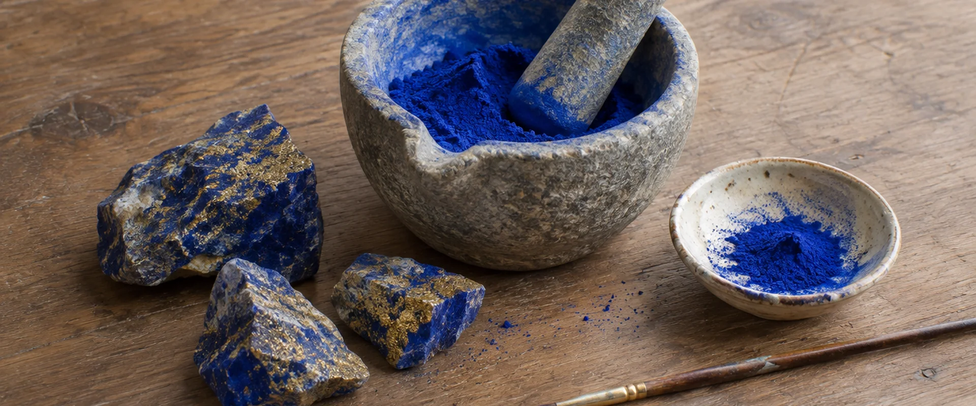
The turban in Girl with a Pearl Earring is blue. Vermeer painted the canvas in 1665, and for that turban he used a pigment that cost more than gold in the seventeenth century: ultramarine.
The pigment was made from lapis lazuli, a semi-precious stone that was ground fine. The main source for Western Europe lay in the quarries of Badakhshan, in present-day Afghanistan. Deposits in the Chilean Andes and near Lake Baikal in Siberia were not developed until the nineteenth century. The name comes from the Latin ultramarinus, ‘beyond the sea’. Around 1300 the powder had reached Venetian traders, via the Silk Road and then by sea, along the same routes as the spices.
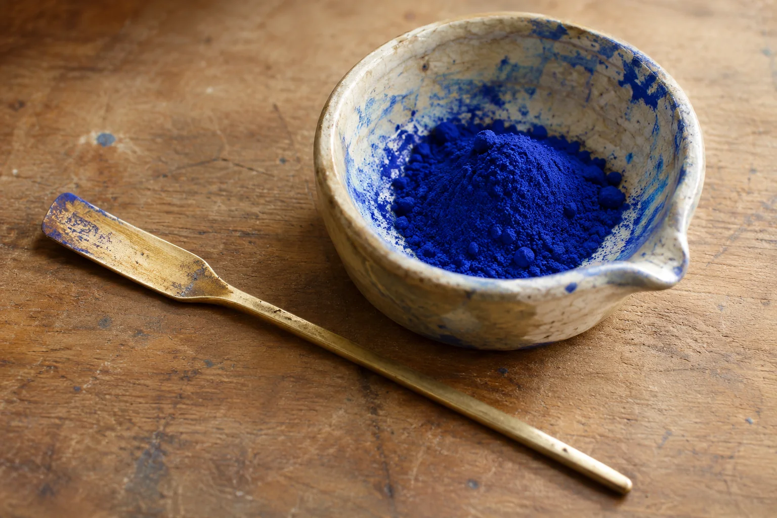
In the Renaissance ultramarine was one of the most important and most precious pigments in European art. Painters used it for the robes of Christ and of the Virgin Mary. Blue belonged to Mary, and only the wealthiest patrons could afford the pigment.
The list is long. Duccio used it in The Healing of the Man born Blind (1307/8-1311), in egg tempera. It has been found in the Ghent Altarpiece by the brothers Van Eyck (c. 1432), especially in the Mystic Lamb. Research there also revealed two areas of much later overpainting. Botticelli and Filippino Lippi made a purple around 1470 by tinting an opaque lead white underpainting with madder lake and glazing coarse ultramarine particles over it. Between 1640 and 1650 Sassoferrato painted a Virgin whose cloak is a vivid ultramarine.
The great names who worked for the Church bought it too. For Michelangelo’s Last Judgment (1536-1541) the Vatican ordered large quantities. Titian used it for the sky and the garments in Bacchus and Ariadne. Rubens combined ultramarine with indigo in his Descent from the Cross (1612-1614). Van Dyck laid it over indigo for his Charity (1627-1628), as a tint and as a glaze in the blue cape.
Vermeer does something different with it. Where other painters kept blue for accents, he used it in shadows, skies, fabrics and reflections. He painted in thin, transparent layers, the glazing technique, and that gives his canvases a soft, velvety depth. He sets blue next to warm colours such as yellow, ochre and red, for balance and depth. That is how he shows cold shadows and daylight from a window.
That blue is also found in A Young Woman Seated at a Virginal (1670-1672). It is in the curtains and in the highlights on the arm, and a blue-green dress is mixed with green earth. Anyone who looks closely sees more than one blue. In Vermeer it is colour that makes space, and not only a showpiece for the viewer.
The stone itself is much older than all those paintings. The oldest paintings with the pigment are wall paintings beside the Buddhas of Bamiyan in Afghanistan. A legend has it that Cleopatra used it as eyeshadow. Lapis lazuli was already on the sarcophagus of Tutankhamun and in a headdress in the Sumerian tomb of Queen Puabi. As a pigment it appears in Europe in the fourteenth century. Fra Angelico used it, and the colour is sometimes called ‘Fra Angelico blue’. With it he painted Christ on the Cross, with the Virgin, Saint John the Evangelist and Cardinal Torquemada, in 1453-1454. Perugino used it in 1500 for the blues of his Polittico della Certosa di Pavia.
It was the first blue that kept its colour, and it was often valued more highly than gold. The price reflected the long trade routes. Whoever used it showed the high price and the purity, and that gave a work prestige.
The pigment stayed expensive because of the stone and the road to get it. Only around the 1820s did someone manage to make an artificial version. After that the stone lost its place in the studio. Manet, Renoir and Van Gogh already worked with the artificial version. Van Gogh used it in 1889 in the deepest blues of A Wheatfield, with Cypresses. Natural and artificial ultramarine look almost alike, but laboratory tests show the difference. A researcher can check which of the two is in a painting, and that has exposed forgeries.
A pure blue in a seventeenth-century cloak or turban therefore also says something about the patron: only the very rich could pay for it.
Practical
Raw material: lapis lazuli from, among other places, Badakhshan, Afghanistan
Name: Latin ultramarinus, ‘beyond the sea’
Examples: Girl with a Pearl Earring (1665), A Young Woman Seated at a Virginal (1670-1672)
Artificial version: since the 1820s